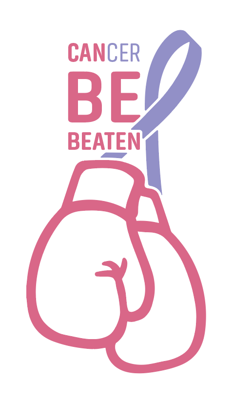
This project is a freelance opportunity that I had the pleasure of working on for a family friend that is currently battling cancer. He contacted my parents knowing that I study graphic design and asked for a logo to represent himself, as well as his fellow cancer fighters at the hospital. As his plan was to print them onto shirts and sweaters and sell them at the hospital gift shop, I was determined and excited to develop a powerful logo to hopefully inspire and empower.
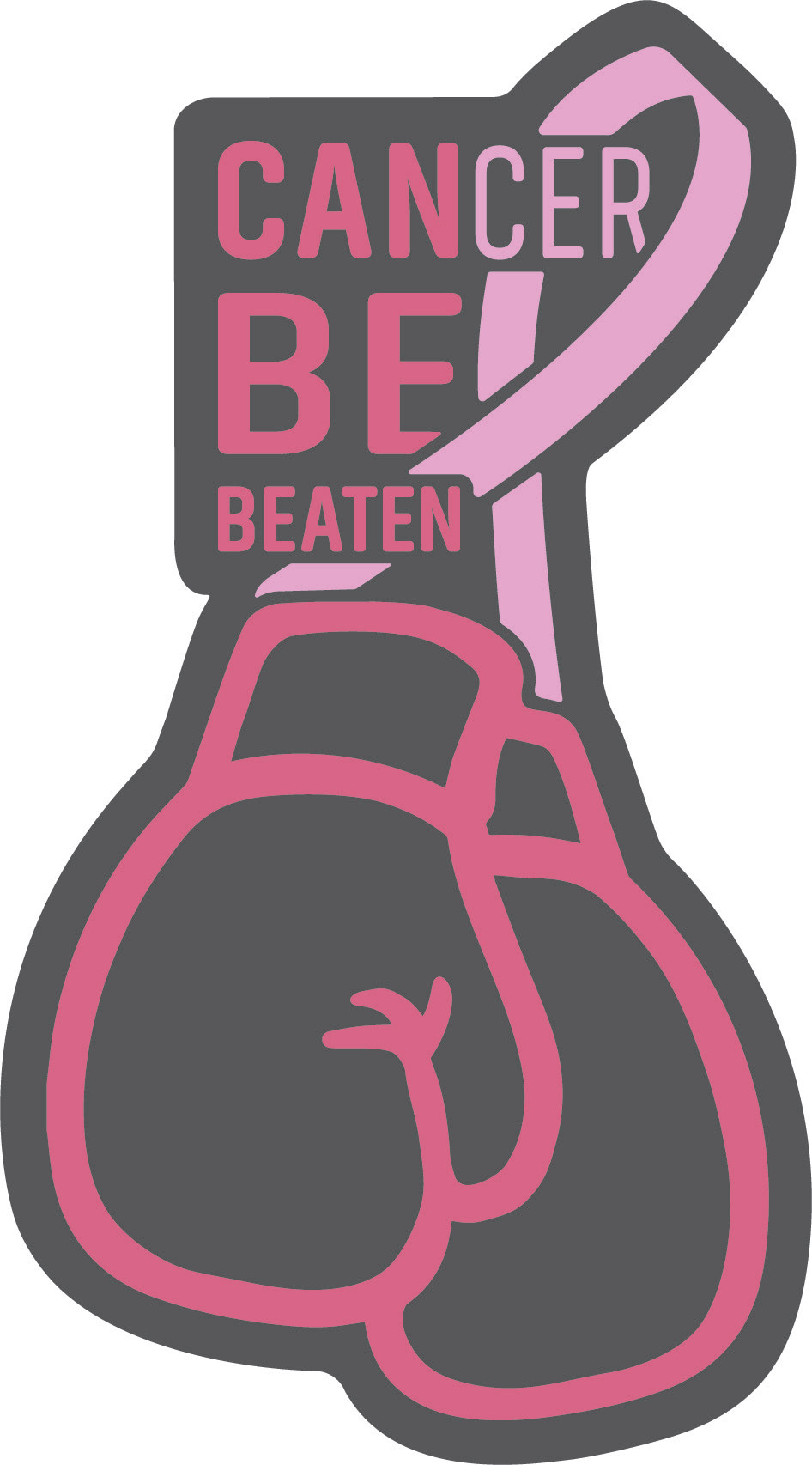
I started the process with some basis sketches and brainstorms of various key words. The one that inspired this logo was the word "fight" in which I immediately thought to represent with boxing gloves. The ribbon as the boxing gloves' laces was a secondary idea which I knew would give the logo some originality along with the play with words in the title.
Continue to see the digital process from beginning to end!
Above are the first rough digital versions of the logo that I created. I immediately noticed that the boxing gloves needed some slight modification, and the ribbon needed to look more like the ribbon. Once I refined those, I continued making iterations and mainly playing around with the text.
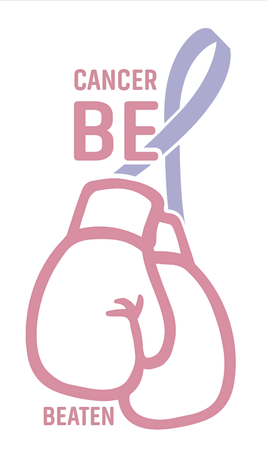


After further modifying the ribbon, my main issue from here on was integrating the text into the logo. Once I finally figured out how to do so, I brightened the colors up a little and submitted it as my first draft.
This was my initial final logo, but I was told by the client that the word "CAN" had to be slightly bigger, so I had to widen both the gloves and the ribbon to accommodate that request.
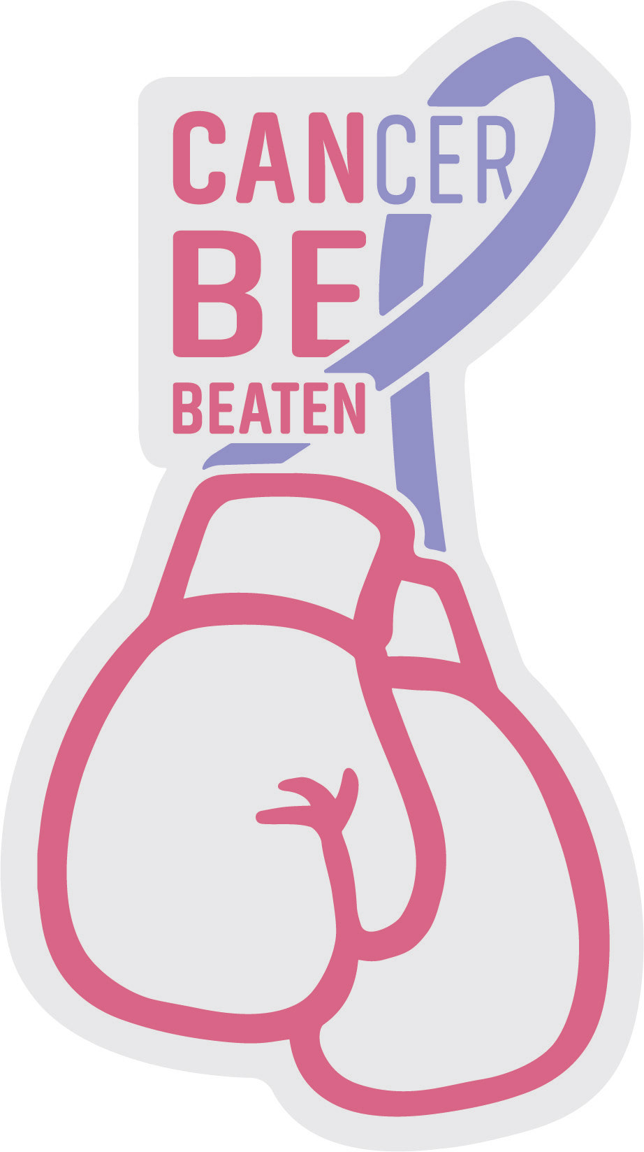
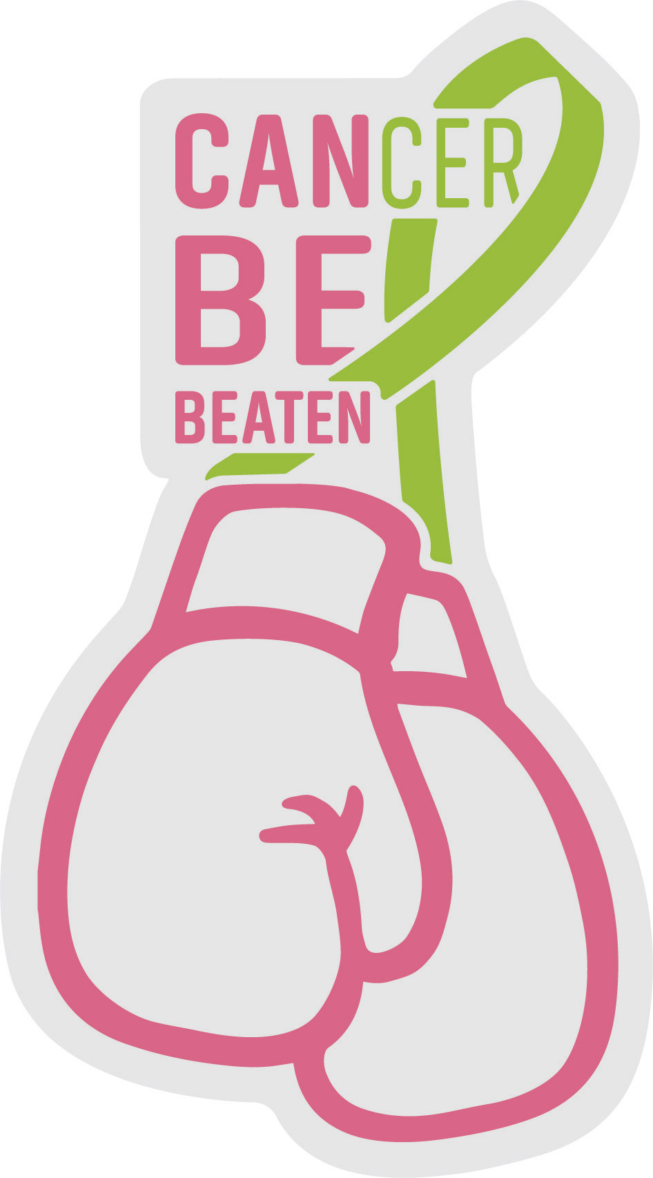
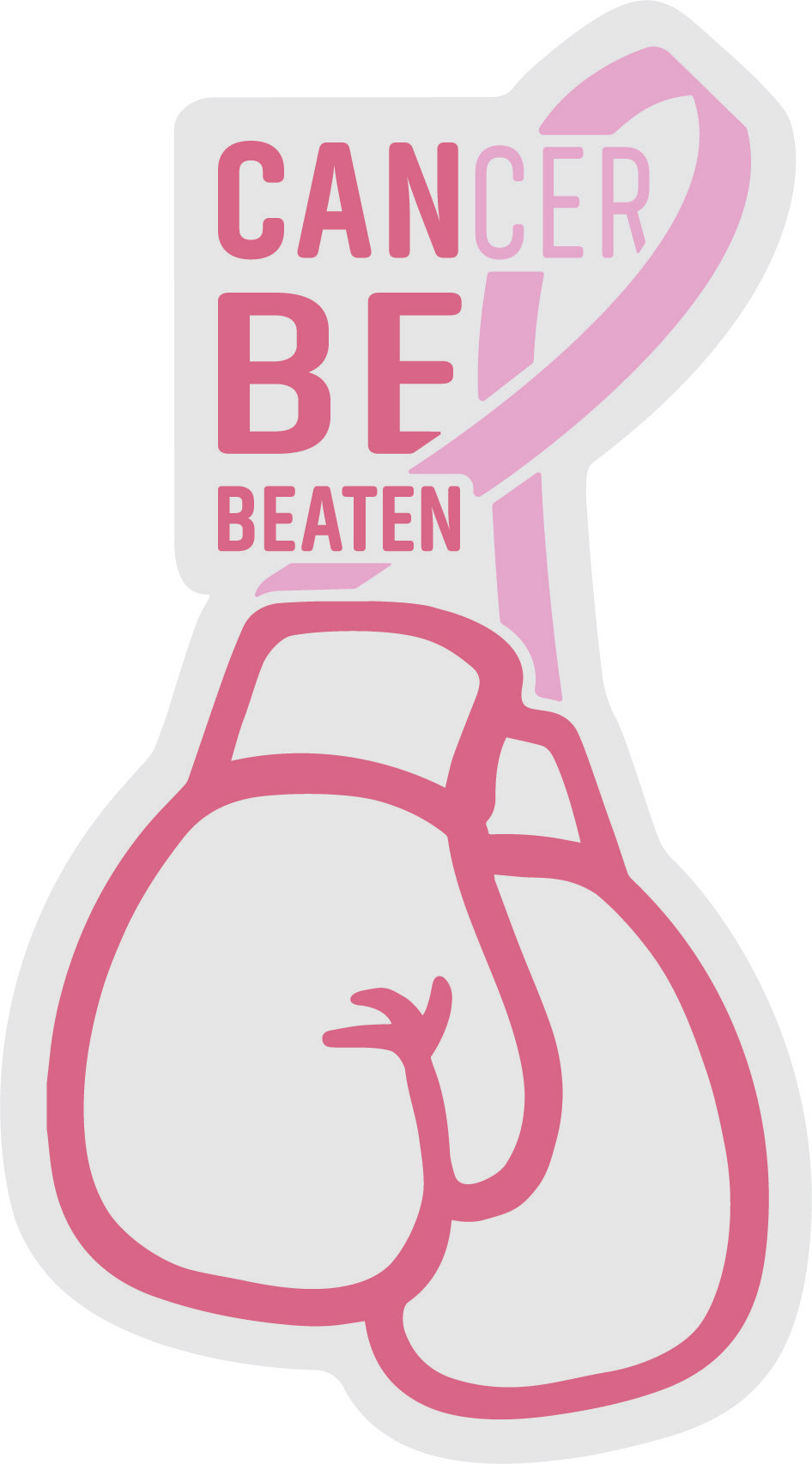
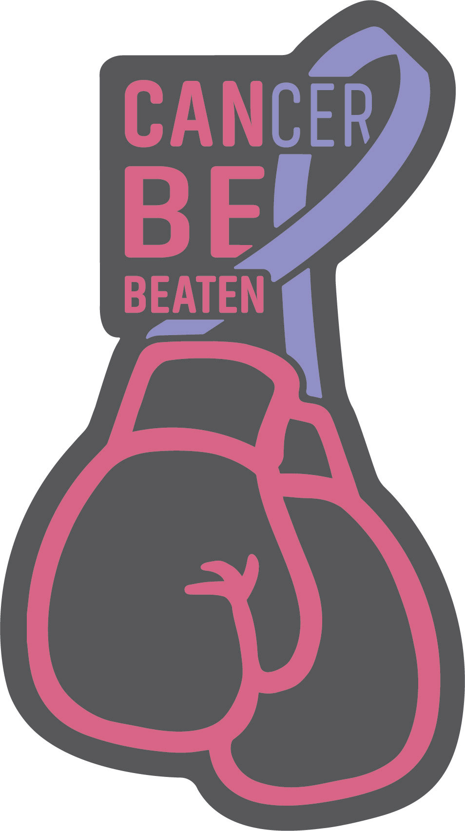
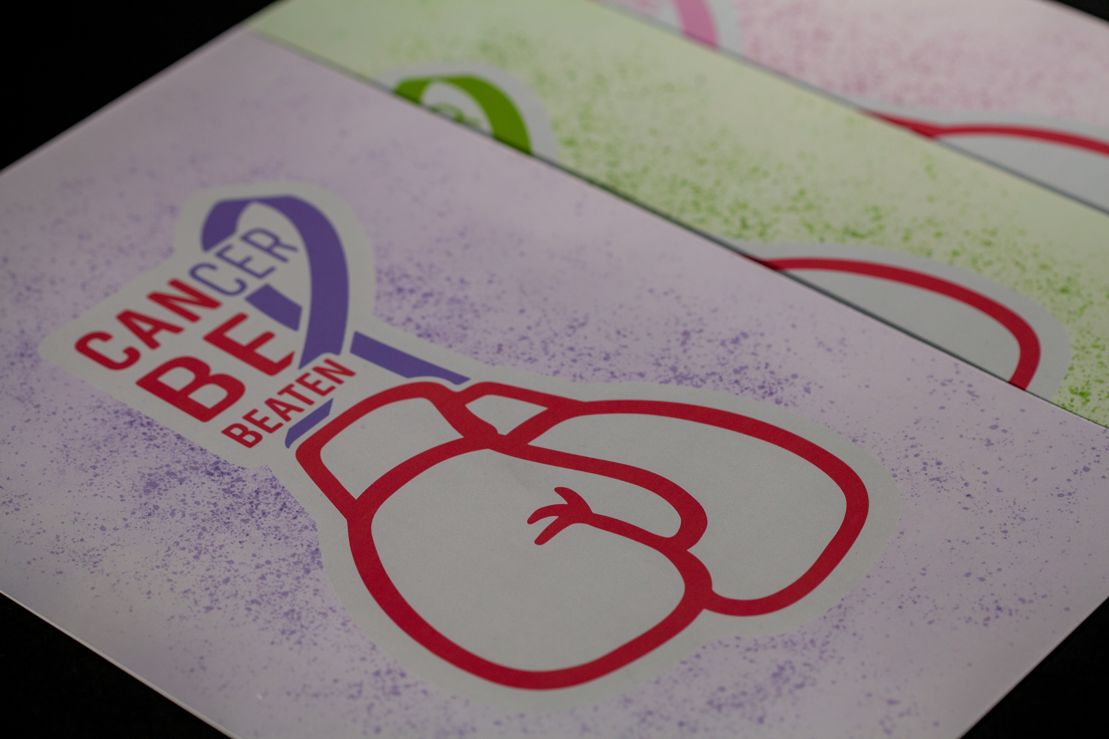
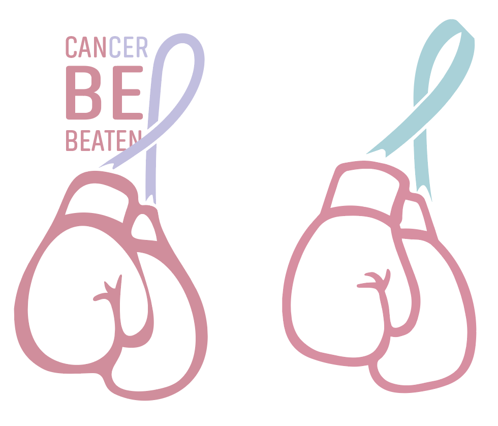
Below is the final logo along with color variations that can be modified to represent different types of cancer. I also decided to make them into stickers as well as posters!